
 Translate
Popover
Add small overlays of content to any element for housing secondary information.
Popovers whose both title and content are zero-length are never displayed.
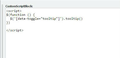
Important: it's required to add code below to to use this tool.
<script>
$(function () {
  $('[data-toggle="popover"]').popover()
})
</script>
Add code to customScriptBlock section of your page. It's located under Advanced Settings. If you are using on an addon, add code to parent page's customScriptBlock section.
Basic usage
Dismiss on next click
Use the focus trigger to dismiss popovers on the next click that the user makes.
Specific markup required for dismiss-on-next-click
For proper cross-browser and cross-platform behavior, you must use the <a> tag, not the <button> tag, and you also must include the role="button" and tabindex attributes.
Options
Options can be passed via data attributes or JavaScript. For data attributes, append the option name to data-, as in data-animation="".
| Name | Type | Default | Description |
|---|---|---|---|
| animation | boolean | true | Apply a CSS fade transition to the popover |
| container | string | false | false |
Appends the popover to a specific element. Example: |
| content | string | function | '' |
Default content value if If a function is given, it will be called with its |
| delay | number | object | 0 |
Delay showing and hiding the popover (ms) - does not apply to manual trigger type If a number is supplied, delay is applied to both hide/show Object structure is: |
| html | boolean | false | Insert HTML into the popover. If false, jQuery's text method will be used to insert content into the DOM. Use text if you're worried about XSS attacks. |
| placement | string | function | 'right' |
How to position the popover - top | bottom | left | right | auto. When a function is used to determine the placement, it is called with the popover DOM node as its first argument and the triggering element DOM node as its second. The |
| selector | string | false | If a selector is provided, popover objects will be delegated to the specified targets. In practice, this is used to enable dynamic HTML content to have popovers added. See this and an informative example. |
| template | string | '<div class="popover" role="tooltip"><div class="arrow"></div><h3 class="popover-title"></h3><div class="popover-content"></div></div>' |
Base HTML to use when creating the popover. The popover's The popover's
The outermost wrapper element should have the |
| title | string | function | '' |
Default title value if If a function is given, it will be called with its |
| trigger | string | 'click' | How popover is triggered - click | hover | focus | manual. You may pass multiple triggers; separate them with a space. manual cannot be combined with any other trigger. |
| viewport | string | object | function | { selector: 'body', padding: 0 } |
Keeps the popover within the bounds of this element. Example: If a function is given, it is called with the triggering element DOM node as its only argument. The |